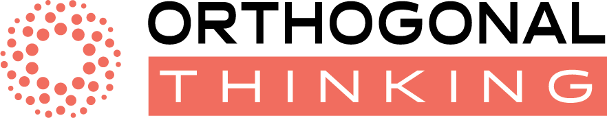
Geometric precision meets creative, non-linear thinking.
This project was created for an entrepreneur who needed a logo to visually represent the idea of approaching problems from independent and unconventional angles. The goal was to design a mark that feels structured, modern, and strategic while still suggesting creative, non-linear thinking. The circular mark is composed of graduated dots that increase in size as they orbit the form — implying both movement and a different way of seeing. "ORTHOGONAL" is set in bold geometric type while "THINKING" is reversed out of a warm coral rectangle. The font Halogen and accent color #F06E5E work together to feel contemporary and confident.